I’m a true believer that when you enhance a space, whether through renovation or furniture, that you should get your money’s worth in its use. What’s the point otherwise? When it comes to building or replacing a deck, it all comes down to design. A good deck design will lead to it being used.
I went home to Maine this summer and visited some family friends and saw first-hand how a poor deck design doesn’t work for homeowners. Our friends recently had their outdoor living space updated with a deck and patio. While it was large, I realized that all the furniture was placed in only 2/3rds of it. When I asked what they were planning for the other part they said nothing. They weren’t sure how or if they were going to use it. That area was completely useless to them, and in my opinion not worth the added cost.
At Archadeck Outdoor Living, we pride ourselves on “better building by design.” All of our projects are custom designed to fit the clients’ needs, wants, tastes and budgets. Function is one of the most important considerations our deck designers make. How is the space going to be used normally? Will it be used as a place to cook and eat? Is it a space to have quiet time? Based on answers to questions like this, a space can be created that will look beautiful and be functional.
The existing home’s architecture plays a large role in deck design as well. Our goal is to make the new space look like an extension of the home, not an afterthought. I hate looking at outdoor living spaces that look like they were bought out a magazine and simply placed on the property. The style and finishes just don’t match and it just looks odd.
Very few Archadeck outdoor living spaces are square decks added to the back of the home. The boxy nature of a deck like that, while it works in some instances, doesn’t always allow for the flow and function that homeowners truly want.
Here are some great deck before and after photos from our franchisees:
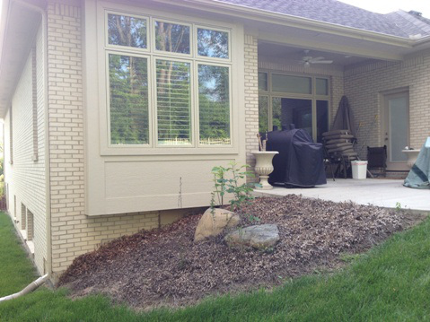
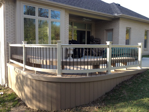
This homeowner had a small patio that wasn’t big enough for entertaining family friends. They wanted to expand over this unused mulch bed. The local Archadeck deck designer in West Central Ohio was about to created a curved deck design with a built-in bench that invites conversation. The railings and posts were finished in the same color as the window trim to make a seamless transition from house to deck. deck-central-ohio
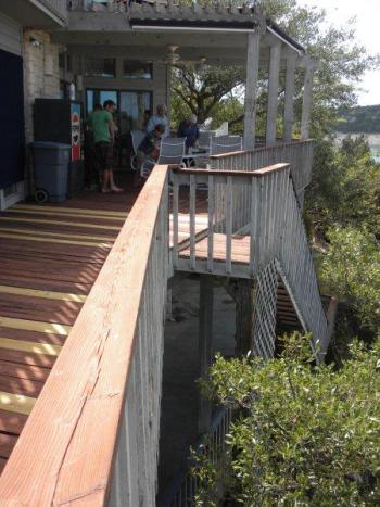
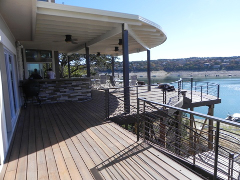
This deck in Austin had seen better days. While it has a great view (see the canal in the background), it didn’t have much space. The property owners wanted one main place for cooking, entertaining and relaxing in the sun. Below is the final outcome. It’s a big difference; don’t you agree? The outdoor kitchen is really the anchor to the space, but everything is open to the view, making it a big focal point. This home has a very contemporary architecture so our designer stuck with minimal lines and open iron rails to match existing features.
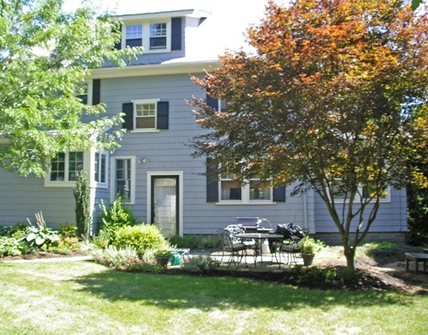
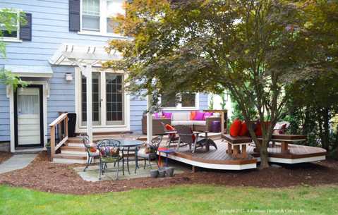
This outdoor space in the greater Boston area was just too small. While the homeowners, liked the small patio area for dining they wanted a more inviting space. Our deck designer created a space will several areas for sitting and entertaining. By adding new french doors and a deck that’s pushed back towards the tree, it pulls people outside into the new space. I love the white trim on the deck and pergola that brings the clean white trim from the windows into the outdoor space.
If you are wondering how a custom deck design could enhance your outdoor spaces, please contact your local Archadeck office.