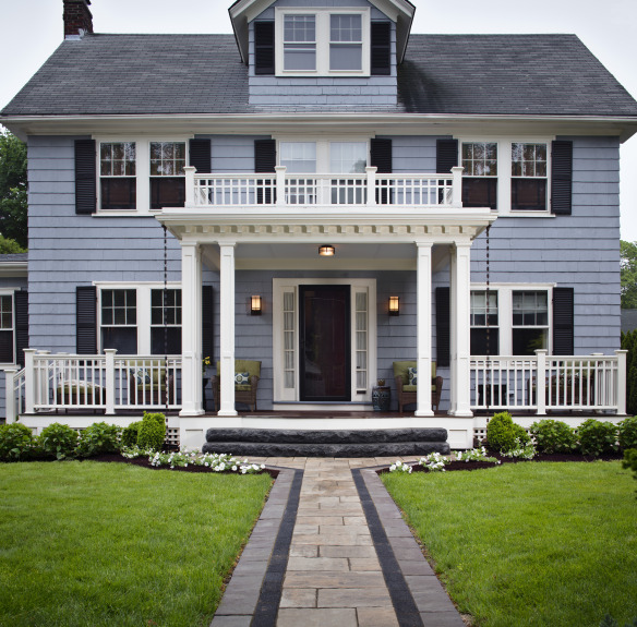
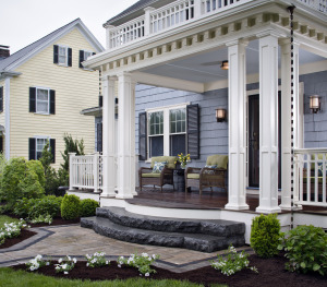
We post a lot about the absolutely beautiful backyard spaces that our porch, patio and deck contractors design and build, but sometimes we don’t give enough credit to the front of the home. When I saw the pictures of this front porch I knew I had to share it. It’s classically beautiful that gives the home a true “wow” factor.
The owners of this property needed an updated place to welcome guests and entertain them. They live is a great neighborhood that they wanted to be able to enjoy from their front yard (and then have privacy in the back). Our deck builder in Boston created a space that spans the width of the house and includes both covered and open spaces.

When designing the space, the Archadeck of Suburban Boston knew they wanted a portico area that provided guests with some coverage. In the cold Massachusetts nights, the homeowners didn’t want friends and family waiting in the falling snow (or rain). The portico only covers the front door because if it too went the width of the house it would block too much sunlight into the home. Many deck and porch designers don’t take the inside of the home into account when creating the space, but an outdoor project can have a major impact on the inside of the house. The front windows wouldn’t allow much sun into the home’s front windows if the porch area were any wider.
 While we didn’t want the covered area to be too wide where it affects light into the home, it is wider than the average portico. Most porticos aren’t much wider than the front door and that can oven make it look cramped. By creating more room under the roof structure, it makes the whole space look more inviting and accessible. The width is kept at the bottom of the front the stairs and then tapers down the to the walkway (which we will talk about below).
The columns, ceiling and railings were finished in white to give a clean look. If a darker color were used, it wouldn’t have the same crisp first impression. It’s so light.
While many front porches have stone floors, wood decking was used across this entire project. It makes it unique and the deep browns look great with the blue of the home and white of the railings.
I love the front walkway to this home because it isn’t cookie cutter. It’s special. The three colors are the perfect complement to the rest of the front facade. The dark lines bring out bring out the black shutters and door, but it would be way too dark for the entire walkway.
If you have questions on how to make your home more welcoming, please reach out to your local Archadeck office.